




Hi, my name is Elling Lien and I’m addicted to making fonts.
It all started a few weeks ago. A few years ago I made a font, uploaded it to a popular free font site and eventually forgot all about it.

Fast forward to June 1, when a friend asked me if they could use it for a project. I checked the site and the font had been downloaded more than 39,000 times.
At first I was flattered (“Wow! My font!”), then a bit confused (“Wow! A crappy font!”), then a bit irritated at myself (“Ugh! A crappy font!”)
Although I have made fun of Papyrus and Comic Sans before, I swear I’m not much of a typeface elitist. But I just knew I could make a better font, and here was something I just threw together without much thought that people were downloading and (presumably) using. It felt almost irresponsible to have put such a sloppy font out there, which could very well be wreaking havoc on posters and ads around the world.
So I decided to make one more free font.
In a week, that one free font turned into three free fonts…

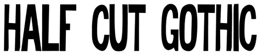

Yeah, by now I’m totally obsessed.
But it’s been fun. I made all of these by hand, and since most of my daytime work is done sitting in front of a keyboard, it’s been refreshing. I love a good excuse to doodle on paper, or piece things together, like the rock font.
All of these above were done free hand and then touched up on the computer, and I’m pretty happy with them. This weekend, though, I decided to make something a bit more geometric and ordered.
So I grabbed some graph paper, decided on a few rules, and set to work on this one…
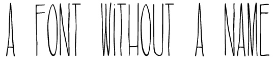
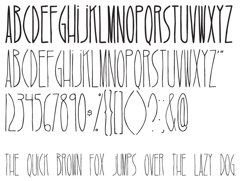
I’m quite proud of it. It’s got a bit of an Art Deco feel, but with a loose, contemporary character. For a fun font I think it’s pretty much ready to go, but as you can see, it doesn’t have a name. There’s where I need your help.
What do you think about this font? What should I name it? How would you describe it? How does it make you feel?
Click on the image to get a better look:
Leave your suggestions below, and if I use yours, I’ll include your full name in the font version credits! Thanks gang.

June 14th, 2011 at 11:17 am
Also, if anyone is curious about how to make their own font, let me know here. If there’s enough interest I could write a how-to from what I’ve learned making these.
June 14th, 2011 at 11:23 am
The Narrows.
June 14th, 2011 at 11:26 am
Gatsby!
June 14th, 2011 at 11:26 am
DIY is a great idea as well!!
June 14th, 2011 at 11:28 am
It reminds me of a Roald Dahl book for some reason. Maybe you can call it The Big Friendly Giant.
June 14th, 2011 at 11:31 am
Ooh I think Narrows is awesome.
I think it looks tall; I was thinking Stretch or Ladders or something evoking height. Like Height
June 14th, 2011 at 11:32 am
Tall Tale?
Pulling?
(kinda simple suggestions)
June 14th, 2011 at 11:35 am
I love fonts as well ( but I don;t know how to make them ! The new font reminds me of skinny legs – or daddy long legs ( but that exists) .. so i vote skinny legs…
June 14th, 2011 at 11:38 am
You’re probably thinking of Quentin Blake! What a great illustrator.
June 14th, 2011 at 11:39 am
Haha.. Skinny Jeans?
June 14th, 2011 at 11:57 am
Stringbean Sans?
I would be interested in learning how to make fonts myself.
June 14th, 2011 at 12:02 pm
wow all excellent suggestion – love stringbean…
June 14th, 2011 at 12:08 pm
Dali Long Legs
June 14th, 2011 at 12:33 pm
I don’t have a suggestion, just wanna say great job on these! Awesome work.
June 14th, 2011 at 1:18 pm
Times Newf Roman
or
Jim Long’s Hand
BUT… Narrows is very good. Very.
June 14th, 2011 at 1:49 pm
Storybook!
June 14th, 2011 at 1:59 pm
longpond font.
so far as i know, there must be like 50 different ponds named “long pond” in newfoundland. nice work!
June 14th, 2011 at 2:07 pm
Lien Sans
June 14th, 2011 at 2:31 pm
Spaghettini
June 14th, 2011 at 3:14 pm
How about “Altitude”? I really like a lot of the suggestions so far, too, though; esp. “The Narrows” and “Skinny Legs”.
June 14th, 2011 at 3:46 pm
excellent – or how about Lien Lean
June 14th, 2011 at 4:07 pm
In the whole “height” vein, what about Falaise? It also kind of sounds like malaise.
June 14th, 2011 at 4:23 pm
agreed indeed
June 14th, 2011 at 6:51 pm
First thing that came to mind was “Skinny Latte”. :)
June 14th, 2011 at 6:52 pm
And I would love to learn how to make fonts!
June 15th, 2011 at 11:51 am
What about “stick figures?” Reminds me of stick people cartoons…
June 15th, 2011 at 3:38 pm
i try 2 stay as high as possible?
June 20th, 2011 at 7:55 am
I would love to learn how to make fonts!
Narrows is my vote.
June 22nd, 2011 at 12:10 pm
To give you an update, I’m working on a cleaner version and different font weights, plus weird alternates. This might be a while.
June 22nd, 2011 at 2:03 pm
i see you have looked at Mancini
June 22nd, 2011 at 3:25 pm
Is there a font named Mancini?
June 24th, 2011 at 12:57 am
This is more for the initial font above, not the latest version, but it reminds me of the title font for Where the Wild Things Are. Maybe you could call it Sendak. or Wild Rumpus. or Tzippy and Moishe.
June 24th, 2011 at 8:32 am
(This is in addition to the hand drawn one. I’m still partial to scribbly-looking fonts.)
June 27th, 2011 at 12:29 am
The font reminds me of the Nightmare Before Christmas! What about “Jack Skellington”, or just “Skellington”? Hehe
September 9th, 2012 at 6:26 pm
Think this looks great! Very interested in fonts too, a how to would be fab.
April 1st, 2013 at 5:35 am
I really love your font! Where can I download it?
But one tip. If I were you I would change “G”. For me it doesn’t make sense that it finishes in the center.
April 1st, 2013 at 5:36 am
And maybe “S” has the same problem. But it doesn’t bother me that much as “g”!
April 1st, 2013 at 9:12 am
Good point, Ewa. I see what you mean. Thanks for the advice!
As for a place to download it, I’ve been chipping away at it ever since I posted this last year and I haven’t made it available to the public yet. Soon? Maybe? Haha.. We’ll see.