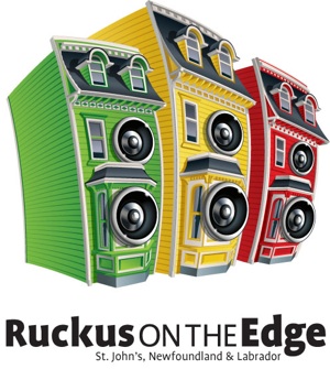
this looks an awful lot like the old fred’s records logo, with the dancing rowhouse wearing headphones and sunglasses, which in my opinion was far cooler, because the rowhouse was actually the store. this logo makes me think that the juno’s will be held in someone’s house on bond street or something. i understand that this rowhouse imagery is synonymous with st.john’s, but it really has been beaten to death. the victorian mouldings and bay windows are found on some houses sure, but i wouldn’t point that out as uniquely representative of st.john’s. as far as the logo goes, seems to be part of the larger commercial branding exercise thats happening to newfoundland. i guess it is easier to sell culture if you reduce the complexity of it. i am slightly uncomfortable with it being sold back to me in this form though, and yeah it sort of does look like a stackable washer/ dryer unit.
Thank Target Marketing for that… They seem to be beating all the stereotypical Newfie crap to death for the provincial government. The tourism TV spots drive me up the wall. And of course, we’re all Irish in Newfoundland and Labrador, as evidenced by the abomination of a provincial logo and the commercials that invite you to call “Patrick” or “Connor” or “Sheilagh” for more info.
They really play up the technicolor shit in their TV commercials when they show downtown St. John’s and they’re doing it again here.
PUBLISHER'S NOTE: Comments (which include restaurant reviews, rants, Wha? questions and I Saw You submissions) appearing on the site are not the opinion of The Scope, but only of the comment writer. We may remove questions, answers, and comments that are hateful, inflammatory, spam, or any other nonsense. Please play nice. More detailed terms here.





August 17th, 2009 at 3:19 pm
this looks an awful lot like the old fred’s records logo, with the dancing rowhouse wearing headphones and sunglasses, which in my opinion was far cooler, because the rowhouse was actually the store. this logo makes me think that the juno’s will be held in someone’s house on bond street or something. i understand that this rowhouse imagery is synonymous with st.john’s, but it really has been beaten to death. the victorian mouldings and bay windows are found on some houses sure, but i wouldn’t point that out as uniquely representative of st.john’s. as far as the logo goes, seems to be part of the larger commercial branding exercise thats happening to newfoundland. i guess it is easier to sell culture if you reduce the complexity of it. i am slightly uncomfortable with it being sold back to me in this form though, and yeah it sort of does look like a stackable washer/ dryer unit.
August 17th, 2009 at 11:44 pm
Thank Target Marketing for that… They seem to be beating all the stereotypical Newfie crap to death for the provincial government. The tourism TV spots drive me up the wall. And of course, we’re all Irish in Newfoundland and Labrador, as evidenced by the abomination of a provincial logo and the commercials that invite you to call “Patrick” or “Connor” or “Sheilagh” for more info.
They really play up the technicolor shit in their TV commercials when they show downtown St. John’s and they’re doing it again here.